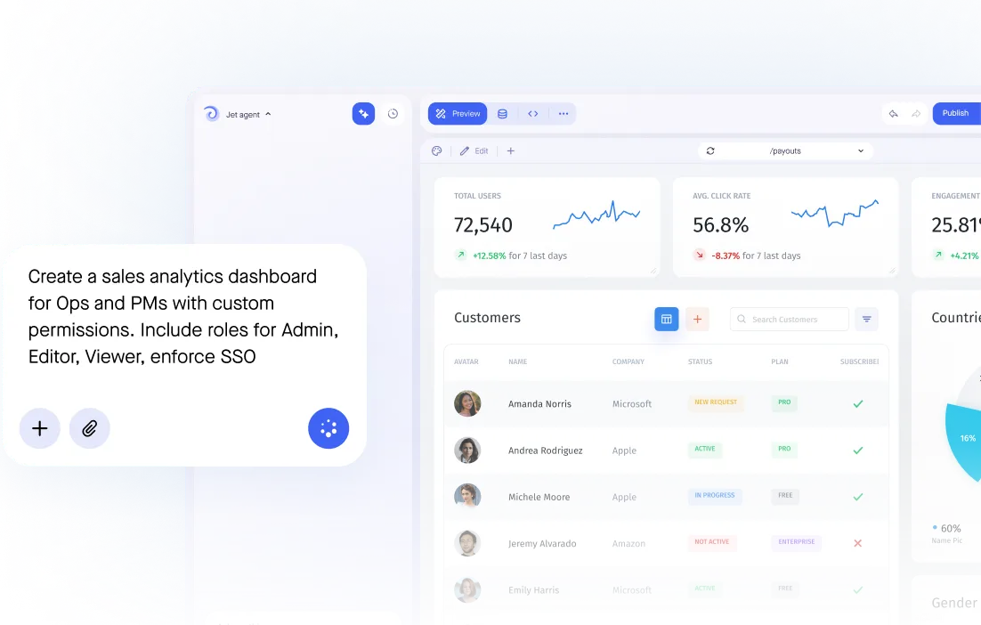
KPI Dashboard app that fits your process
KPI Dashboard that lets you give each team the view they need and nothing else. Connect your database. Control who sees what. Self-host it.
Trusted by Some of the World’s Best Product Teams





Build exactly what your team needs
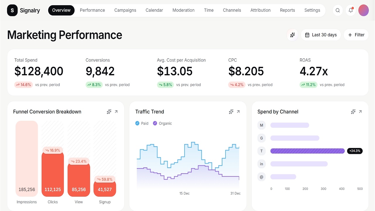
Your metrics stay in the warehouse and tools you already run. Jet adds the dashboard layer on top, scoped so each team sees its own numbers and nothing else.
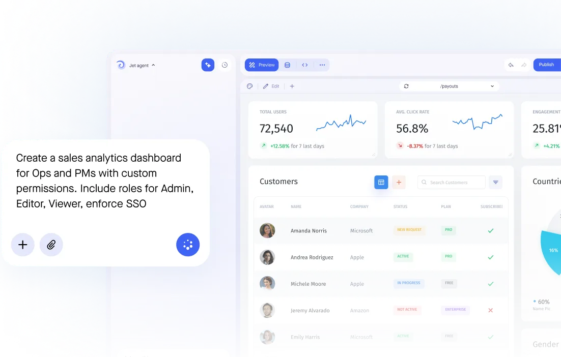

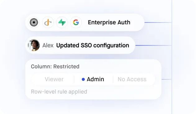
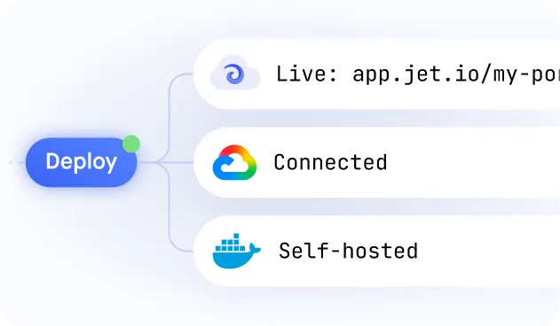
Build secure app fast



Build secure app fast
.jpeg)
Dashboards on Your Live Data — No Warehouse Required
.jpeg)
Charts, Tables and Pivots in One View
.jpeg)
Role-Based Access to Every Metric
.jpeg)
Filters and Drill-Downs for Self-Service
.jpeg)
Generated From a Prompt, Refined by You
Similar Use Cases


.png)








.svg-min.png)


.png)


































Frequently asked questions
A KPI dashboard shows the handful of numbers a team is actually measured on, live, with the definition of each one visible. The hard part is not the chart — it is agreeing what the number means and where it comes from.
BI tools are built for analysts exploring history. A KPI dashboard is built for the people being measured, so it loads fast, shows current state, and lets someone click a number to see the rows behind it.
Yes. The same dashboard can show a regional manager their region and a VP the roll-up, driven by their role rather than by maintaining separate copies.
Directly from your production databases, warehouse or APIs. No nightly export, and no second definition of revenue living in a spreadsheet.
Yes. A KPI that surfaces a problem can link straight to the records causing it, with permission to fix them if that is their job.