Sales Dashboard
App
Sales Dashboard
Overview
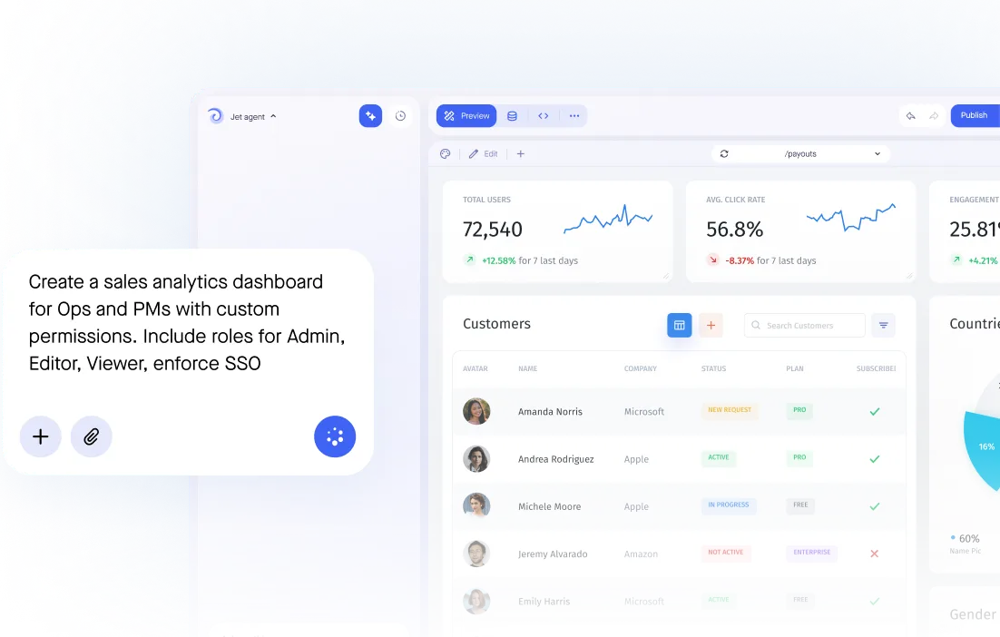
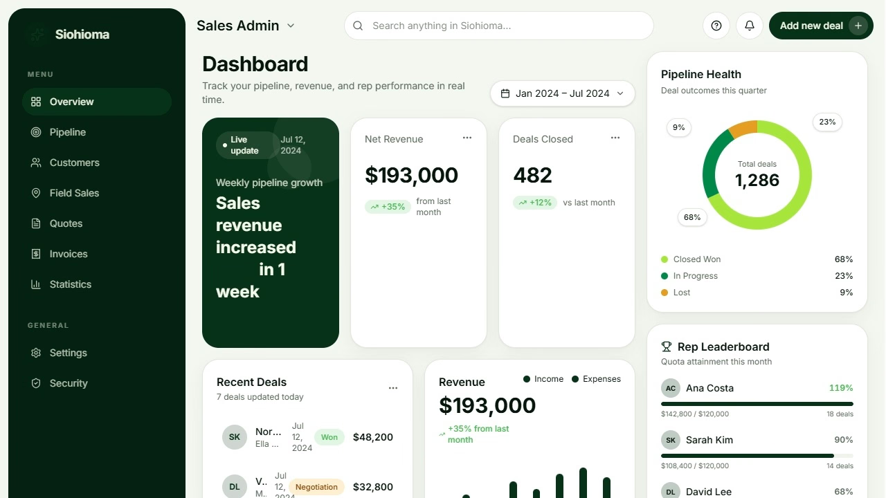
A sales dashboard template is a pre-built, customizable interface that aggregates and displays key sales metrics-pipeline value, quota attainment, deal progression, win/loss rates, and revenue trends-in one location, pulling directly from live data sources. Instead of starting from a blank canvas, sales teams get a ready-made layout of summary cards, charts, tables, and alerts that can be configured to match any sales process, team structure, or industry.
The core problem is straightforward: sales managers and reps spend hours each week pulling manual reports from CRMs, merging spreadsheets, and assembling slide decks with data that's already stale by the time it reaches leadership. This manual sales reporting cycle introduces errors, creates version conflicts, and delays the data driven decisions that actually move pipeline forward.
This sales dashboard template connects directly to your existing CRM data-Salesforce, HubSpot, PostgreSQL, or custom systems via REST API-to create live dashboards in minutes rather than days. Once your data source is linked, every chart, card, and table updates automatically as deals progress, reps log activities, and revenue closes. A sales dashboard template like this provides a single source of truth for data, so the entire sales organization works from the same numbers.
The template adapts to your reality. Whether you run a 5-person startup sales team or coordinate multiple sales teams across regions and product lines, you can adjust pipeline stages, quota logic, activity types, role-based views, and branding. Customization and flexibility help tailor dashboard views to team needs and key metrics without requiring engineering resources.
Explore the template in Jet Admin's library, connect your CRM, and see your live sales data rendered in a working dashboard today.
Why use this sales dashboard template
Sales leaders consistently face the same friction: critical data locked inside CRMs that requires manual extraction, transformation, and presentation before anyone can act on it. Sales managers often spend 20 or more hours each week compiling pipeline reports, forecasting summaries, and quota tracking spreadsheets. Meanwhile, sales reps lack real time visibility into their own performance until it's too late to course-correct, and leadership relies on snapshots that are days or weeks behind current data.
Centralized data eliminates manual reporting and reduces errors. When your dashboard pulls directly from your CRM or database-rather than from exported CSVs pasted into multi-tab spreadsheets-you eliminate version conflicts, copy-paste mistakes, and the overhead of maintaining parallel reporting tools. Sales dashboards provide real-time visibility into sales performance, so everyone from the individual sales representative to the CRO sees the same pipeline health, the same revenue targets, and the same deal stages. This consistency makes revenue forecasting more reliable and strategic planning more grounded.
Real-time pipeline and performance visibility. With live data flowing into your dashboard, you see total pipeline value, at-risk deals flagged by aging or missing activity, and performance trends by month, quarter, or year-without waiting for someone to build a report. Dashboards should highlight bottlenecks in the sales pipeline automatically, surfacing stalled opportunities that might otherwise slip through the cracks. Real-time dashboards improve forecast accuracy by 28–30%, a significant advantage when leadership needs to project how much revenue will close this quarter.
Standardized metrics across reps and regions. One of the most persistent challenges in a growing sales organization is metric inconsistency-one region defines "qualified opportunity" differently, another counts activities differently. This template enforces uniform definitions for deal stages, revenue fields, and key performance indicators, so comparing sales across teams, products, or geographies produces meaningful analysis rather than noise.
Collaboration without miscommunication. Shared dashboard views align sales, marketing, operations, and executives on the same critical metrics. Marketing sees lead source performance alongside conversion rates. Revenue teams see pipeline coverage and forecast accuracy. Leadership accesses executive sales summaries without requesting custom reports. A good sales dashboard transforms complex data into actionable insights to track performance, replacing email chains and status-update meetings with a single, always-current view.
What it replaces. Manual CRM exports, multi-sheet spreadsheets, PowerPoint decks built from stale numbers, long-lag dashboards maintained by overextended data teams, and the constant back-and-forth of "can you pull these numbers?" messages. Sales dashboards can increase sales by 29%, not because the dashboard sells for you, but because it frees your team to focus on selling instead of reporting.
Template features
Pipeline value summary cards
Display total pipeline value, value by stage, and value by sales rep in easy-to-read card format at the top of the dashboard. Dashboards should group data logically with top-line revenue at the top and trends in the middle, so your most critical metrics are visible the moment you open the page. These cards update in real time as deals progress through CRM stages, giving sales managers an instant read on pipeline health without clicking into a single report. Filter by product line, region, or expected close date to narrow focus-for example, pipeline expected to close in the next 30 days.
Revenue trend visualization
Line and bar charts display revenue trends by month, quarter, and sales representative, comparing actual performance against targets with visual indicators like colored target lines and shading. This is where you track how much revenue your team has generated versus plan, identify seasonal patterns, and spot early signals of acceleration or decline. For B2B SaaS teams, this can be configured for monthly recurring revenue (MRR) or ARR, which is crucial for subscription businesses. Year-over-year and quarter-over-quarter comparisons help sales leaders contextualize current performance within longer revenue growth trajectories.
Quota attainment tracking
Individual gauge charts show each rep's progress toward quota, making it immediately clear who is on pace, who is ahead, and who needs support. The template uses JavaScript formulas to calculate attainment percentages based on CRM opportunity data and quota targets. Quota attainment can be broken into monthly or quarterly pacing to check interim progress rather than waiting for period-end surprises. This feature supports variable quota structures-by product, territory, or team-so the logic matches your actual compensation model.
Deal management table
A filterable table displays every open deal, sortable by stage, rep, close date, average deal size, region, and last activity. Drill-down capability lets you click from summary cards directly to individual deal records to inspect details, notes, and next steps. This is where sales managers identify patterns: which deals are missing activity, which have pushed close dates repeatedly, and which are large enough to materially affect the quarter. The table supports pagination and efficient data retrieval to handle thousands of deals without performance degradation.
Activity performance leaderboard
Rankings of sales reps by calls made, emails sent, meetings booked, and conversion rates create a sales activity dashboard layer within the template. Sales teams use dashboards to monitor performance and coach effectively-this leaderboard surfaces who is generating motion and who may need coaching on outreach volume or technique. Time-filtered views (past week, past month) let managers track trends rather than snapshots. Actionable analytics in dashboards help identify trends and bottlenecks in the sales process, so coaching conversations are backed by data rather than intuition.
Win/loss rate analysis
Charts display win rates by product, region, deal size, lead source, and time period. Win rate indicates the percentage of opportunities converted to sales, and slicing it across multiple dimensions helps identify patterns-perhaps a specific product line consistently underperforms, or deals above a certain size lose more often. Where CRM data includes loss reason categories, those surface here too, feeding directly into sales strategy and process improvements.
Deal aging alerts
Automated highlighting flags deals that have been in a stage longer than a configurable threshold-for example, more than 14 days in "Proposal Sent" or more than 30 days in "Negotiation." These alerts can appear as color-coded rows in the deal table or trigger notifications via Slack or email through workflow automations. Customizable thresholds per stage and per region ensure the alerts reflect your actual sales cycle rather than arbitrary defaults. AI flags unusual patterns for early problem detection, adding another layer of intelligence to deal risk identification.
Role-based dashboard views
Role-based views in dashboards help distinguish the needs of different team members. Sales reps see only their own deals and performance metrics-record-level filtering enforced through granular permission management ensures data isolation without building separate dashboards. Managers view team-wide data with individual rep breakdowns. Executives access high-level summaries and trends-total team revenue, pipeline coverage, forecast accuracy-without the noise of individual deal records. Sales dashboards can display both high-level KPIs and granular activity metrics for better decision-making, and role-based views are how you deliver each without overwhelming anyone.
Who is this sales dashboard template for?
- Sales managers and directors who need real-time pipeline visibility and team performance insights for daily coaching, forecast calls, and strategy decisions. This template gives them both summary views of pipeline health and the ability to drill into individual rep data points, deal aging, and activity trends-replacing the manual report compilation that consumes their weeks.
- Revenue operations teams responsible for sales forecasting, territory planning, and process optimization across the entire sales organization. RevOps uses this template to enforce consistent metric definitions, monitor forecast accuracy, tie sales data to finance and marketing sources, and ensure quota assignments are accurately reflected. Connecting multiple data sources-CRM, billing database, spreadsheets-into one dashboard eliminates the fragmented reporting that plagues scaling companies.
- B2B SaaS sales teams tracking subscription revenue, customer acquisition cost, expansion revenue versus new business, and customer lifetime value. The template accommodates recurring revenue models, MRR/ARR tracking, and renewal pipeline alongside new business pipeline. Sales cycle length measures the time taken to close deals, and for SaaS teams with distinct trial-to-paid conversion funnels, this metric is essential to monitor.
- Inside sales and SDR teams monitoring activity metrics, lead-to-opportunity conversion rates, and quota attainment. Their workflow centers on outreach volume and conversion efficiency, and this template surfaces calls, emails, meetings, and pipeline contribution per rep in a clear leaderboard format. 65% of organizations using mobile CRM reach sales targets, and mobile-ready dashboards allow these reps to access critical data from anywhere-between calls, on the road, or working remotely.
- VP of Sales and CROs requiring executive-level dashboards for board reporting, strategic planning, and cross-regional performance comparison. They want high-level revenue trends, pipeline coverage ratios, forecasted revenue versus actuals, and win rate trends-not individual deal records. This template's role-based views deliver exactly that executive sales summary without building a separate dashboard.
- Small business owners who wear multiple hats and need simple, automated sales tracking without dedicated analytics resources. Connecting a PostgreSQL database or even Google Sheets to this template provides immediate visibility into pipeline stages, rep performance, and revenue trends-no analyst headcount required. Most teams can set up sales dashboard templates in a few hours, making this practical even for teams of two or three.
How to set up your sales dashboard template
Step 1: Select the sales dashboard template. Start by choosing the sales dashboard template. Preview the layout to confirm it includes the components you need-pipeline cards, revenue charts, quota gauges, deal tables, and activity leaderboards. You can also generate formulas and customizations with AI to accelerate configuration.
Step 2: Connect your data source. Use native connectors for Salesforce, HubSpot, or PostgreSQL/MySQL to establish a live connection to your CRM data. For custom CRM systems, configure a REST API connection. If your team tracks data manually, Google Sheets can serve as an interim data source. Real-time data integration is a key feature of effective sales dashboard templates, so prioritize direct connections over periodic exports.
Step 3: Map your CRM fields to template components. Align your CRM's opportunity stages, revenue fields, rep assignments, close dates, products, and regions to the template's charts, cards, and tables. For example, ensure your "Negotiation" stage maps correctly to the pipeline summary cards, and that your quota target field connects to the attainment gauge logic. This step is where data accuracy is established-incorrect field mapping produces misleading dashboards.
Step 4: Customize the interface. Adjust chart types (line, bar, funnel), colors, and company branding. Rename stages, add or remove metrics, and configure filters for time periods, regions, and product lines. Dashboards should emphasize clarity, consistency, and focus on actionable metrics-resist the temptation to display every available data point. Experts recommend focusing on 5–8 actionable metrics per role. Arrange high-priority metrics like quota attainment and pipeline at risk at the top of the view.
Step 5: Set up role-based permissions. Configure roles so sales reps access only their own pipeline data through record-level filtering, managers see their entire team's metrics, and executives view cross-team summaries. This ensures sensitive revenue, commission, or forecasting data is appropriately restricted. The template supports this natively through Jet Admin's permission system-no need to duplicate dashboards for each role.
Step 6: Configure workflow automations. Set up scheduled email reports that deliver PDF or CSV dashboard snapshots to leadership weekly. Configure Slack notifications for deal milestones-deals aging past threshold, pipeline dropping below coverage targets, or reps hitting quota. These automations replace the manual "Monday morning report" with reliable, automated delivery.
Step 7: Test with sample data and validate. Before rolling out, run sample data through the dashboard. Check edge cases: very large deals, reps with multiple territories, missing close dates, deals with no recent activity. Verify quota attainment calculations, filter behavior, and chart accuracy. Review with sales leadership and operations stakeholders to confirm metric definitions match expectations.
Step 8: Publish and roll out. Deploy the dashboard with mobile-responsive settings so field reps and traveling sales executives can access it from any device. Mobile-first design increases sales target achievement by 65%, making responsive publishing a practical priority, not a nice-to-have. Provide brief training to show reps how to view their own metrics and managers how to use drill-downs and alerts. Schedule regular forecast meetings around the dashboard to drive adoption.
Connect your Salesforce, HubSpot, or PostgreSQL instance, load the template, map your fields, and see live sales metrics by end of today.
Frequently asked questions
What is a sales dashboard template?
A sales dashboard template is a pre-built interface that connects to CRM data and displays key sales metrics-pipeline health, quota progress, deal velocity, win/loss rates, and revenue trends-in real time. Rather than building charts, tables, and cards from scratch, the template provides a ready-made layout and logic that you customize to match your sales process. Sales dashboard templates are commonly available in Excel, Google Sheets, and BI platforms, but templates built on platforms like Jet Admin connect directly to live data sources for always-current reporting. 67.7% of business leaders will use dashboards by 2026, reflecting a broad shift toward visual, real-time sales analytics.
Can I connect this to Salesforce or HubSpot directly?
Yes. Jet Admin offers native connectors for both Salesforce and HubSpot, enabling direct data synchronization of opportunities, deal stages, revenue fields, rep assignments, and activity records without manual exports or third-party ETL tools. If your data lives in PostgreSQL or MySQL, those connect natively as well. For custom CRM systems, configure a REST API or GraphQL connection. This direct connectivity means your dashboard always reflects current data, not yesterday's export.
How do I set up quota attainment tracking for each rep?
You need two data elements: each rep's quota target (set annually, quarterly, or monthly in your CRM or a separate reference table) and their closed/booked revenue from opportunity records. The template uses JavaScript formula transformations to calculate attainment percentage-actual revenue divided by quota target-and renders this as gauge charts or progress bars per rep. To support pacing, break quotas into sub-periods and check interim attainment so managers can identify reps who are behind before the quarter ends. Average deal size helps assess revenue potential within each rep's pipeline as part of this tracking.
Can sales reps see only their own pipeline data?
Yes. Record-level filtering and role-based access control ensure that when a sales rep opens the dashboard, data automatically restricts to only their assigned deals, activities, and quota metrics. Managers see their full team's data with individual breakdowns, while executives access aggregated views. This is configured through Jet Admin's permission system-no separate dashboards needed per user. Intuitive design makes complex information clear and easy to understand, even when the underlying permission logic is sophisticated.
How do I automate weekly sales reports to leadership?
Use Jet Admin's workflow automation features to schedule dashboard snapshots as PDF or CSV exports delivered via email on a recurring schedule-every Monday morning, end of quarter, or any cadence you set. You can also push alerts to Slack or Teams channels when key thresholds are crossed: pipeline dropping below coverage targets, deals aging beyond acceptable limits, or reps hitting milestone attainment. This replaces manual report assembly entirely. 51% of sales professionals currently use AI in dashboards, and AI-driven automations can further enhance these reports with predictive insights on deal closure probabilities.
Can I customize the KPIs and metrics shown on the dashboard?
Fully. While the template provides defaults-pipeline health, win rate, revenue trends, quota attainment, deal aging-you can add, remove, or rename any metric. Swap chart types (bar to line to funnel), add segmentation filters (by product, region, or lead source), and modify formula logic to track specific sales KPIs relevant to your business. Whether you need customer lifetime value, customer acquisition cost, or custom activity conversion rates, the template's customizable dashboards accommodate your definitions. Good dashboard design practices emphasize clarity, consistency, and focus on actionable metrics, so customize toward the 5–8 metrics that actually drive your team's decisions.
How do I track deal velocity and average sales cycle length?
Sales cycle length measures the time taken to close deals, calculated using date fields from your CRM: creation date, stage entry dates, and close date. The template computes average cycle duration across all won deals over a selected period, and you can slice this by product, region, or deal size to compare subsets. Deal velocity combines throughput (number of deals closing per period) with average deal age and win rate to measure how efficiently your pipeline converts to revenue. These calculations use date field logic and formula transformations within the template, giving you a clear view of where deals accelerate and where they stall. AI analyzes thousands of data points for predictive lead scoring, which can layer on top of velocity metrics to forecast which deals are most likely to close next.

.svg)


Use Cases
Categories
Features
Similar templates




Connect & sync your data with 30+ data sourse’s


Build frontend Apps 10x faster


Frequently asked questions
Sales cycle length measures the time taken to close deals, calculated using date fields from your CRM: creation date, stage entry dates, and close date. The template computes average cycle duration across all won deals over a selected period, and you can slice this by product, region, or deal size to compare subsets. Deal velocity combines throughput (number of deals closing per period) with average deal age and win rate to measure how efficiently your pipeline converts to revenue. These calculations use date field logic and formula transformations within the template, giving you a clear view of where deals accelerate and where they stall. AI analyzes thousands of data points for predictive lead scoring, which can layer on top of velocity metrics to forecast which deals are most likely to close next.
Fully. While the template provides defaults-pipeline health, win rate, revenue trends, quota attainment, deal aging-you can add, remove, or rename any metric. Swap chart types (bar to line to funnel), add segmentation filters (by product, region, or lead source), and modify formula logic to track specific sales KPIs relevant to your business. Whether you need customer lifetime value, customer acquisition cost, or custom activity conversion rates, the template's customizable dashboards accommodate your definitions. Good dashboard design practices emphasize clarity, consistency, and focus on actionable metrics, so customize toward the 5–8 metrics that actually drive your team's decisions.
Use Jet Admin's workflow automation features to schedule dashboard snapshots as PDF or CSV exports delivered via email on a recurring schedule-every Monday morning, end of quarter, or any cadence you set. You can also push alerts to Slack or Teams channels when key thresholds are crossed: pipeline dropping below coverage targets, deals aging beyond acceptable limits, or reps hitting milestone attainment. This replaces manual report assembly entirely. 51% of sales professionals currently use AI in dashboards, and AI-driven automations can further enhance these reports with predictive insights on deal closure probabilities.
Yes. Record-level filtering and role-based access control ensure that when a sales rep opens the dashboard, data automatically restricts to only their assigned deals, activities, and quota metrics. Managers see their full team's data with individual breakdowns, while executives access aggregated views. This is configured through Jet Admin's permission system-no separate dashboards needed per user. Intuitive design makes complex information clear and easy to understand, even when the underlying permission logic is sophisticated.
You need two data elements: each rep's quota target (set annually, quarterly, or monthly in your CRM or a separate reference table) and their closed/booked revenue from opportunity records. The template uses JavaScript formula transformations to calculate attainment percentage-actual revenue divided by quota target-and renders this as gauge charts or progress bars per rep. To support pacing, break quotas into sub-periods and check interim attainment so managers can identify reps who are behind before the quarter ends. Average deal size helps assess revenue potential within each rep's pipeline as part of this tracking.
Yes. Jet Admin offers native connectors for both Salesforce and HubSpot, enabling direct data synchronization of opportunities, deal stages, revenue fields, rep assignments, and activity records without manual exports or third-party ETL tools. If your data lives in PostgreSQL or MySQL, those connect natively as well. For custom CRM systems, configure a REST API or GraphQL connection. This direct connectivity means your dashboard always reflects current data, not yesterday's export.
A sales dashboard template is a pre-built interface that connects to CRM data and displays key sales metrics-pipeline health, quota progress, deal velocity, win/loss rates, and revenue trends-in real time. Rather than building charts, tables, and cards from scratch, the template provides a ready-made layout and logic that you customize to match your sales process. Sales dashboard templates are commonly available in Excel, Google Sheets, and BI platforms, but templates built on platforms like Jet Admin connect directly to live data sources for always-current reporting. 67.7% of business leaders will use dashboards by 2026, reflecting a broad shift toward visual, real-time sales analytics.